
CEO Dashboard: The New-Age Executive Reporting Tool

Table of Contents
Picture a day in the life of a CEO—it’s drowned in hours spent poring over endless reports and spreadsheets, making sense of data their organization accumulates every day. What if there was a way to track all that data without juggling multiple reports or dashboards for a 360-degree view?
An exclusive CEO dashboard is the solution they need to stay on top of what’s happening, where and when. To thrive in the contemporary data-driven business landscape, executives need a tool that showcases all the KPIs in one place, saving them the pain of going through disparate reports and siloed information for strategic planning.
The need for end-to-end visibility into the organization is real. Consolidated dashboards connect all the dots and present information CEOs need at their fingertips to make informed decisions.
What Is A CEO Dashboard?
Working as a management reporting tool, CEO or executive dashboards help collate, analyze and present handpicked business KPIs in a visually digestible format. These visualizations are tailor-made for the C-suite to track the high-level metrics and gauge the company’s health and performance across departments. From measuring revenue growth to checking cash flows and chasing sales figures, leadership-oriented dashboards provide tangible insights for successful mission control.
With a bird’s-eye view of sales, revenues, marketing, HR, and other critical functions, CEOs are equipped to:
A comprehensive business intelligence (BI) platform that helps string data from different departments, business units, teams, and geographies can yield consolidated CEO reports for real-time assessments and planning.
What Is A CEO Report?
When decision-makers require a detailed overview of the organization’s affairs and important updates that can move the bottom lines, a CEO report can come in handy to serve all these purposes and more. While dashboards present real-time information that’s refreshed regularly, reports collate data spread over a specified period to offer subjective insights about a particular project or campaign.
Simply put, a CEO report serves as an analytical tool with real-time and historical data trends captured in the form of visuals, charts, tables, graphs, etc. Most importantly, it is written as a narrative for the top brass to understand the business performance and find gaps that can cause financial losses down the road.
The way this report is presented makes a real difference. It can be shared as a PDF with the stakeholders or delivered as an intuitive, interactive dashboard.
How Do CEO Reports & Dashboards Drive Business Growth
Businesses can’t make profits based solely on intuition or gut feeling. With actual data insights, they can do that and much more. Viewing critical enterprise data in one alocation enables CEOs to reduce the delays in information transfer and run regular pulse checks to measure results against pre-set goals. Logging in from any device, any time and from anywhere gives them benefits, like:
Tap into Opportunities with Real-Time Insights
As data grows in an enterprise, analyzing its full depth and volume at a faster speed becomes increasingly crucial to gaining a competitive advantage in the market. Mining massive datasets for accurate, updated and timely insights is easier said than done. CEOs need incisive, real-time insights encapsulating the entire spectrum of their organizational data to boost decision agility.
Real-time insights offer input about the focus areas without time lags, allowing companies to adjust their strategies before it’s too late. A CEO dashboard presents all the data over a reliable visualization platform to deliver actionable insights as soon as a user fires a query.
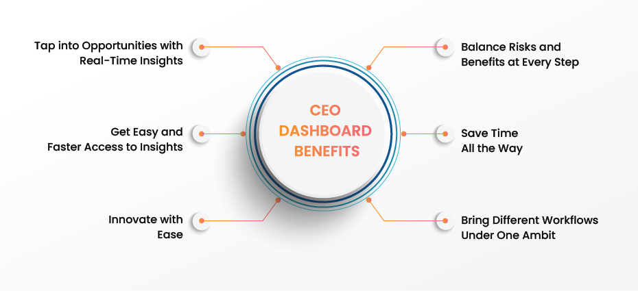
Balance Risks and Benefits at Every Step
Even under immense pressure, C-suite executives are expected to walk a thin line between mitigating risk and making bold decisions for business success. With access to real-time insights on a consolidated location, their work gets easier by several notches.
Dashboarding platforms and software allow users to set up alerts on business-critical metrics to avoid chasing reports that matter the most. They can focus on the strategic roadmap, without losing sight of any growth-impacting number or incidence being overlooked. As a result, progressive and insightful decisions ensue, accelerating their growth potential.
Get Easy and Faster Access to Insights
A powerful BI platform offering customizable CEO dashboards can help the C-suite establish a data-driven culture throughout the organization. A user need not be a tech wizard to access and explore the platform. A user-friendly, drag-and-drop interface helps navigate the platform and interact with numbers without any barriers or unwanted delays.
Customizability allows CEOs to define the KPIs they want to see on the screen, without seeking out IT people for every report. This helps promote adoption of the tool within the organization and establishes a data-driven culture to make informed decisions for business success.
Save Time All the Way
Since the success of any project relies heavily on timely decisions, an exclusive platform for CEOs can be the change-maker. Having all KPIs in one place is not only convenient when making business plans but also saves time by keeping all the insights readily available with a single click. This largely helps in trend analytics over a specific time duration.
Research by Asana says that data workers spend up to 60% of their time sifting through the sea of information they hoard and the tools they deploy for the purpose. From measuring individual performances to determining total spending in a fiscal year, a consolidated dashboard saves valuable time from clicking between screens all day, creating more room for strategic goals.
Innovate with Ease
With exclusivity of the CEO dashboards comes a chance to break all silos and innovate at every step. Instead of analyzing static reports, stakeholders can spend more time and focus on upskilling their existing talent, taking their offerings with a new flavor into the market and finding unforeseen prospects of organizational growth.
Bring Different Workflows Under One Ambit
Executive leadership needs a multi-pane or multidimensional view of all business operations to switch from one perspective to another as needed. A comprehensive CEO dashboard can offer the same by offering insights at enterprise, operational and departmental levels.
The enterprise level is an all-encompassing singular view with critical KPIs, the operational view covers different processes and tools, while the department-level view allows users to delve into the metrics related to specific departments or business units.
Key Steps for Building a CEO Dashboard
Though every platform offers a unique approach to building dashboards for top executives, there are some essential steps that are required to convert a static report into a dynamic, interactive and highly intuitive dashboard. Here they are:
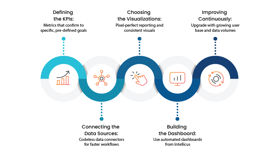
Step 01: Defining the KPIs
With specific, predefined goals, creating a dashboard becomes a lot easier. Based on the intended purpose and audience, KPIs can range from key financial numbers to HR-related data that answers all concerns CEOs face in boardroom meetings.
Step 02: Connecting the Data Sources
A reliable platform allows seamless integration with all data sources using no-code/low-code data connectors. However, before establishing this connection, users must choose the data wisely and clean it properly to avoid mistakes happening due to incorrect or outdated information. Once done, all historical and current data gets synced in one location to show unified insights.
Step 03: Choosing the Right Visualizations
With intuitive and consistent visuals, reading the data becomes less overwhelming and more intuitive for CEOs. For example, bar charts may be a tad bit difficult to create when there is too much data to track. In simpler words, a dashboard should tell a cohesive and compelling data story.
Step 04: Building the Dashboard
Automated dashboards within popular BI platforms like Intellicus are an easy way to consume data and glean actionable insights for C-Suite. Even when using a template, it’s better to choose one that can accommodate all the above parameters without any need to shoehorn data into an unusable format.
Step 05: Iteration and Continuous Improvements
Like any other component of their task list, the reporting tools used by CEOs also need to improvise and upgrade with changing scenarios, number of users and growing data volumes. With an open feedback loop, it’s easier to identify the potential lags and resolve them to offer better user experiences.
5 Top CEO Dashboard Examples
In the words of Ben Shneiderman, “The purpose of visualization is insight, not pictures.” Having said that, finding an intuitive visual story in enterprise data takes a well-concerted approach. The executive dashboards are customizable, making it easier to find one that aligns with the organization’s analytical goals. Some examples worth checking are:
1. Overview Dashboard
Providing daily insights into every aspect of business, an overview dashboard showcases the overall temperature for the C-suite, helping them measure results, identify the outliers or anomalies and take corrective actions to remove any bottlenecks on the way. The indicators on this dashboard cover benchmarks for key functions like sales, finance, human resources and customer services.
Example KPIs:
2. Financial Performance
Since financial data can be massive and complex, executives often need high-level insights as well as deeper visibility into it to ascertain the company’s financial health. The dashboard pulls data from all relevant sources and generates insights that help CEOs map growth with their strategic vision.
Example KPIs:
3. Marketing Performance
As a CMO-focused tool, this dashboard helps collect, manage and analyze the colossal marketing data on one platform. Executives get a 360-degree view of all marketing campaigns, their results, and industry trends for optimized strategies that bring more leads and move the bottom lines.
Example KPIs:
4. Sales Performance
Sales is a department that can enable or delay business success. A consolidated dashboard with insights related to customer churn ratio, upsell/cross-sell campaigns, deals nearing closure, reps’ performance, etc. assist C-level to make data-driven decisions based on the actual sales pipelines.
Example KPIs:
5. Talent Performance
Organizations are often faced with the challenge of retaining their top talent, attracting new talent and reducing churn. The HR dashboard with talent performance metrics can be a portal to understand employee concerns, ensure higher engagement and create a transparent work culture.
Example KPIs:
What Does a CEO Need to See in an Executive Dashboard?
We’ve covered the top CEO dashboard examples and some KPIs above. But they might not suffice for all the information a CEO usually needs to make data-driven decisions. Any dashboard designed for the top executives needs to be comprehensive and offer a holistic view. Here are some important metrics, information and insights it should cover:
Financial Health
Customer and Market
Operational Efficiency
Innovation and Future Growth
Other Important KPIs
Tips for Building Effective CEO Dashboards and Reports
Apart from visual appeal and ease of use, a CEO dashboard should truly serve the purpose of its creation with the right metrics customized for the C-suite. Here are some best practices that can make them a valuable addition to an organization’s analytics stack.
Prioritizing Relevant KPIs
The top stakeholders in any organization don’t need to measure low-level, vanity metrics. Business-critical KPIs are all they want to look at to assess the company’s performance from every probable angle and make adjustments wherever needed.
Creating a User-Friendly Interface
The dashboard ought to be easy to understand for the intended audience—the CEOs. This is accomplished by organizing data in a logical way and using the best combinations of visual elements, be it graphs, charts or tables.
Covering All Core Business Areas
Every business function, unit or department needs a seat at the table to offer comprehensive glimpses into the entire organization. Ideally, the CEO reports and dashboards should cover metrics from sales, marketing, production, HR, procurement, innovation, finance, etc. in a well-structured format supported by dashboard tabs and interlinked widgets.
Ensuring Security and Privacy
CEO dashboards display the most sensitive business data. Hence, a secure environment is critical to protect this data against any breaches or misuse. Setting viewer rights and password protection at all levels can ensure that.
Looking Beyond the Past
Reports and dashboards shared with the top management can’t be just historical, with no emphasis on capturing patterns, trends or predictive analysis. From realistic parameters to consolidating data from diverse sources—historical and real-time—the outcome should offer deeper and clearer insights into all business operations.
Top Features to Expect from a CEO Dashboard Platform
The right combination of usability and performance in a dashboard can make a real difference in how organizations can harness every bit of information they have—from making big moves to creating a competitive edge in the market.
Interactivity, accessibility and intuitiveness are the core competencies expected in a CEO dashboard. Due to these features and several others, data insights become readily available to users across the enterprise. Choose a platform that pulls data from disparate sources and displays it in a unified, standardized format. Some distinguishing features that can boost the platform’s adoption are:
Self-Service Capability
With an inherent capability to organize, visualize and customize information as it’s understood by the business users, most modern-day executive dashboards help foster a data-driven culture in the enterprise. Users can visualize the information and drill through the dashboard to reach any granularity level they want—all without waiting for insights or reports to be uploaded.
From CEOs to knowledge workers in any department, users can derive the insights they need by drilling down and zooming into the deepest layers of enterprise data—right where it resides. A user-friendly interface supported by drag-and-drop functionality makes it easier to navigate and interact with dashboards.
Automated Alerting and Notifications for Anomalies
The world is enthusiastically embracing GenAI like a pedal to metal. There’s no denying the impact of artificial intelligence on every aspect of business, including data analytics. In the same vein, CEO dashboards are evolving, too, with augmented capabilities powered by machine learning and natural language querying.
Setting automated alerts for any outliers or anomalies is one solid step in this direction. The next is sending contextualized summaries directly to the users through mobile notifications or emails. With these advancements, CEOs can remain cognizant of imminent issues and optimize their time by focusing their attention where it’s needed the most.
High-Performance and Customizable Interface
A dashboard is only as good as the KPIs it represents. Keeping this in mind, CEOs typically need a top-level view of the enterprise data without necessarily delving in too deeply. They require a customizable dashboard where they can set the breadth and depth of metrics they need to track daily, weekly or monthly performance based on geography, product or industry. GIS capabilities built into a platform help derive location-based information for a clearer view of such metrics.
For top-notch user experiences, the dashboard should be highly intuitive and allow custom visualizations, meaning users can choose to see the data in a chart, bar graph or table format. Adding the right business elements helps improve the clarity and visibility of critical functions.
Customer Sentiment Analysis
Quantifying customer sentiments, emotions and impulses can help enterprises decode how their consumers feel about them. Based on this analysis, decision makers can tap into popular customer sentiment, understand their feedback and tweak their strategy accordingly. It’s a win-win for all.
As such, a modern-day CEO dashboard with the ability to enable sentiment analysis is a must-have. It allows users to dive deep into conversations on social media, review sites or customer support queries—with machine learning algorithms working behind the scenes. Accumulating all sentiment-related metrics in a single place, the dashboard helps answer business queries like:
What-If Analysis
Building data-based hypotheses or simulations before a major strategic initiative can help future-proof their plans and offer a safety net against black swan events. Many dashboards come with what-if analysis capability to establish the impact of a probable event on the company’s bottom line.
Using historical data and predictive models, the platform helps make accurate assumptions and war game strategies. Scenario planning thus becomes more on-the-point, on-time and agile, never letting any potential risk go unnoticed.
Seamless Data Integration
A multidimensional data dashboard allows users to collate and present data from diverse internal or external sources with impressive flexibility. Providing big-picture trends, the tool allows decision-makers to establish connections between source data and resulting trends by digging into various dimensions.
For instance, this feature can help marketing leaders measure if campaigns are delivering real MQLs—all without juggling between Google Analytics, HubSpot or multiple other tools to draw this conclusion.
Interactive Reporting for Proactive Trend Analysis
Centralized monitoring of KPIs is another way to stay ahead of data challenges and offset downturns. Interactive capabilities like drilling down to the lowest granularity and advanced filters enable users to view data from all angles and never miss any significant figure or growth opportunity.
The interface of modern platforms allows users to compare present data with historical benchmarks to run trend analysis, identify hidden patterns and find root causes for any glitches or delays in the projects.
Next-gen dashboard platforms like Intellicus also come with an option to translate the insights into different languages, making it specifically useful for C-suite execs interacting with customers from different parts of the world.
Mobile Connectivity
The life of a CEO is busy and rarely involves spending the whole day closeted in a cabin. They are on the move most of the time and need insights at their fingertips, using mobile devices, for making quick, informed decisions.
Catering to this need, dashboards allow cross-device accessibility that ensures immediate access to any information or data point they need—from anywhere. With GenAI features like sending automated emails or text messages with contextualized business summaries for matters that require urgent action, this might be the change-maker CEOs need in their analytics suite.
Choose CEO Dashboards from Intellicus for a Comprehensive Business View
Intellicus offers an advanced, GenAI-based analytics platform that unifies enterprise data from multiple sources to establish a single source of truth. The platform allows business leaders to correlate cross-department insights to view the overall business health with just a glance. They can monitor important KPIs and deviations, track performance against targets, receive alerts for critical conditions and stay updated on significant developments—all using augmented analytics powered by GenAI.
Most importantly, users get all-round support from our seasoned professionals, from pre-implementation strategy to post-implementation management. For more details about Intellicus’ capabilities and dashboards, please feel free to contact our experts.

Over the years, data analytics has transformed how businesses operate by helping them look at their data insights. It is Read more

Imagine standing in front of a 3-story building at night. The lights in apartment windows make it look much like Read more