|
|
|
|
The Formula Fields used in Intellicus were defined for the Query Object to allow to add calculated fields at run time. These would then be applied to any report using that Query Object.
With Intellicus 7.2, end user can now add or delete formula fields on the fly while designing a specific report.
You can see Formulas under Ad hoc Visualizer > Design Mode > Report Options. Here you can add a formula field to specify a formula that might be using existing fields.
Properties like the caption for the formula field to appear on the report, its return type, etc. can also be specified.
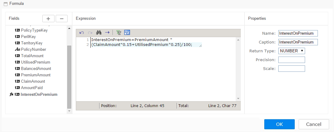
This formula field can be treated like any other field on grid, chart or matrix.
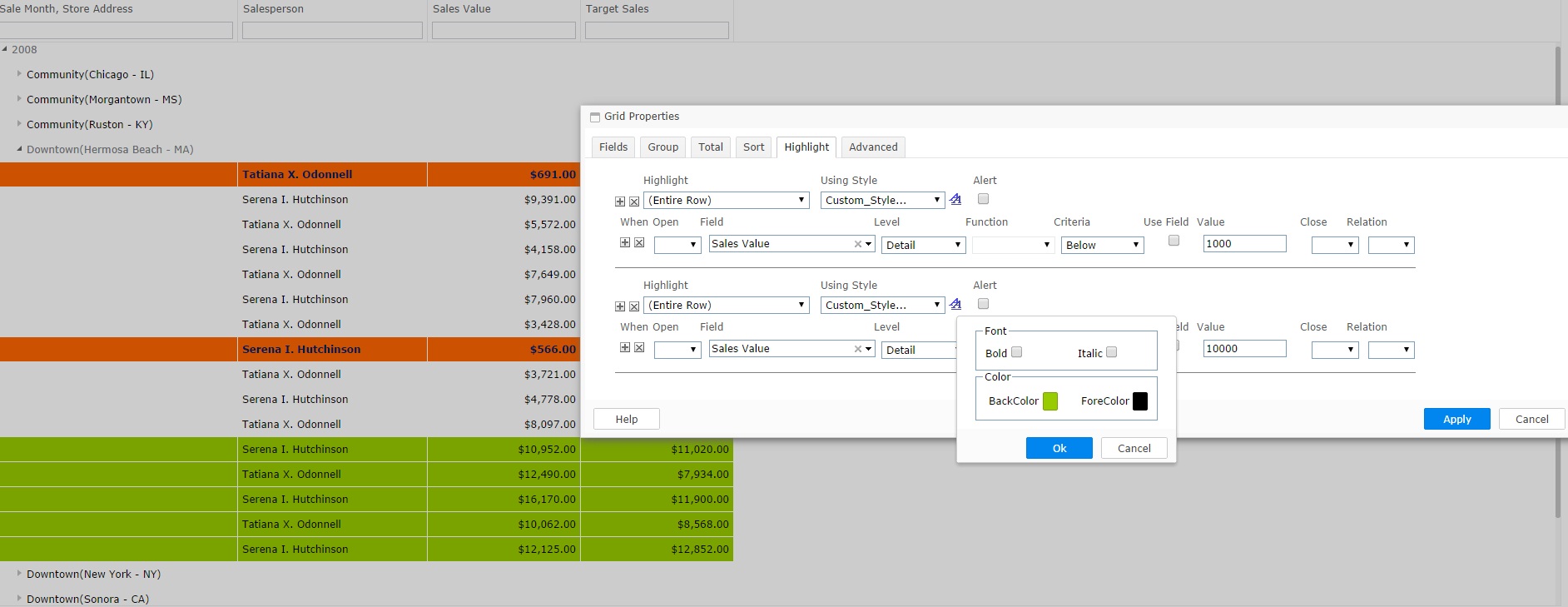
The highlight feature in Ad hoc Visualizer 7.1 enabled selecting the pre-defined styles to highlight records that meet specified criteria. With our latest release, the end user now has control over this styling and can create their own custom highlights.
The styling attributes can be set as per your business needs. The font style can be chosen as either Bold or Italic and color can be picked for both BackColor and ForeColor.
Following is an example report demonstrating highlighting using user specified color to show salespersons who have exceeded performance in achieving certain Sales Value.
The salespersons who have under-performed by not achieving a minimum Sales Value are distinctly highlighted in a different chosen style and color.
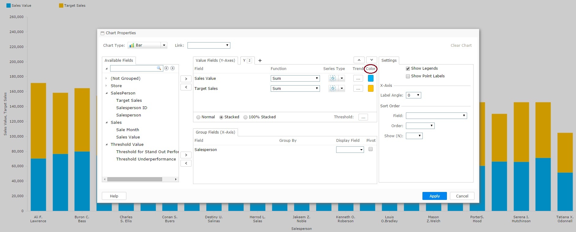
For the various Chart Series, end user has the Color Selector to pick the desired choice of color. This color selection would override the default color picked from the system palette.
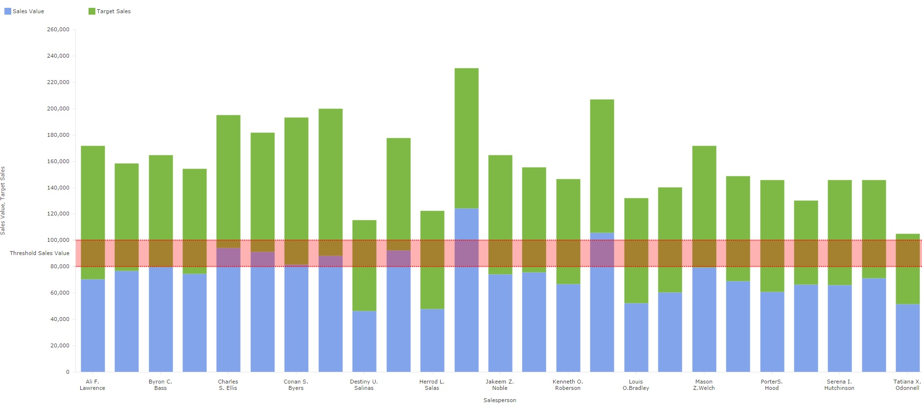
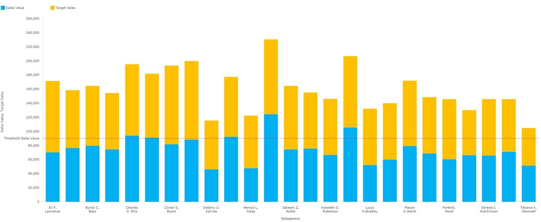
Ad hoc Visualizer charts enable you to specify a Threshold value for fields on Y-axes. You can either specify a value for Threshold Line or range of values for Threshold Band.
You can also specify the color of Threshold Line or Band.
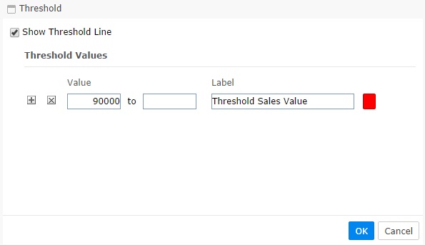
Below is an image that shows a sample visualizer chart showing salespersons who have achieved Sales Value above/below the threshold line:
You can also see salespersons who have achieved Sales Value within a threshold band of values: