|
|
|
|
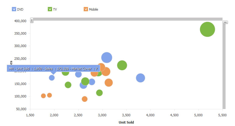
Bubble charting is an important tool for multi dimensional analysis. The data elements can be drawn at an intercection of X and Y axis, where each of X and Y are two measures or values of that element. The size of the element can represent its third measure or value. Bubbles can further be enhanced by more measures of the element contribute to color intensity, 3D level, etc.
Intellicus introduces bubble charts with support upto three values - X, Y and Z.
X (first value) represents where the data element is drawn on X axis, Y (second value) represents where the data element is drawn on X axis, Z (third value) represents size of element.
Intellicus user interface is going through a renovation process. You will see a series of enhancements that makes your user experience better.
The ad-hoc chart wizard looks as below. Although, newly introduced functionality in this release is trend line and forecast, the wizard has been slightly rearranged.
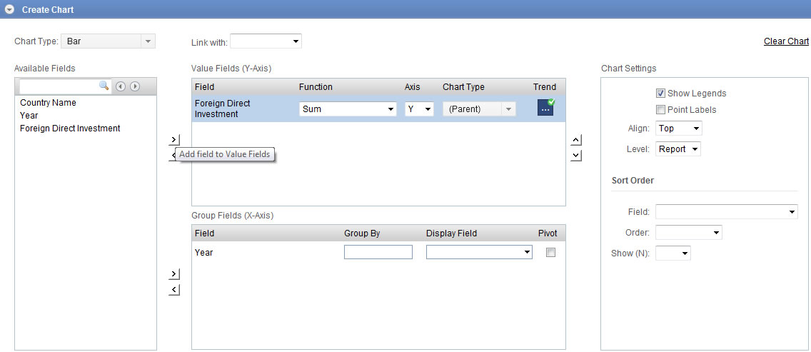
The Chart wizard provides new options to switch on or off legends and data point labels.