|
|
|
|
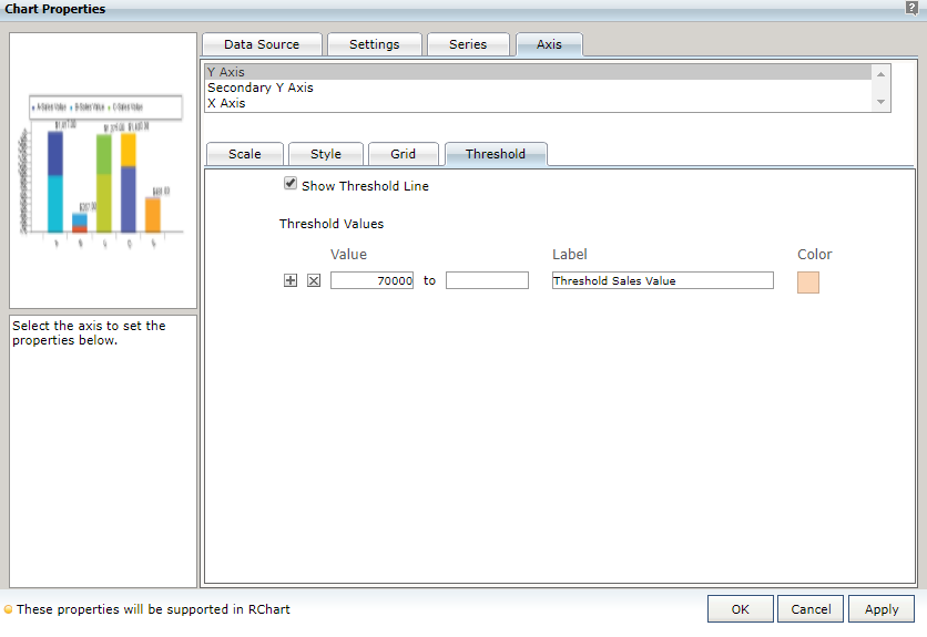
For enhanced data visualization, threshold lines in charts enable you to determine which data points are either below or above a significant value. A Threshold value can be specified for fields on Y-axes.
You can either specify a value for Threshold Line or range of values for Threshold Band.
You can also specify the color of Threshold Line or Band.
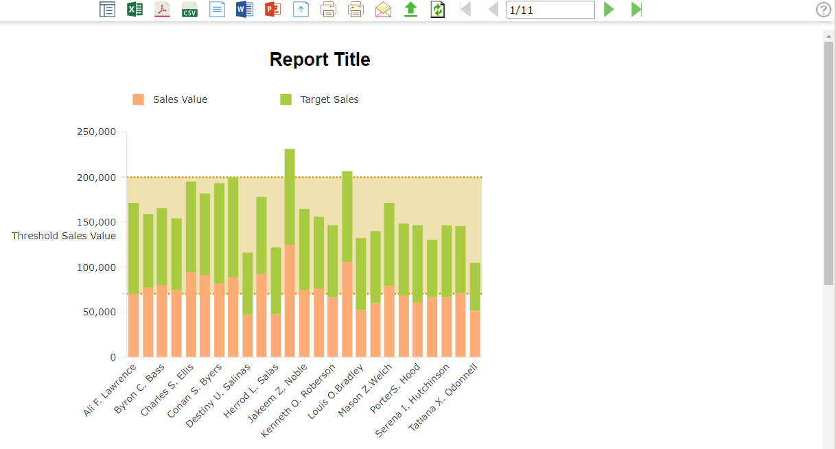
For example, let us analyze performance of salespersons across certain locations. Below is an image of a sample chart showing salespersons who have achieved Sales Value above/below the threshold line:
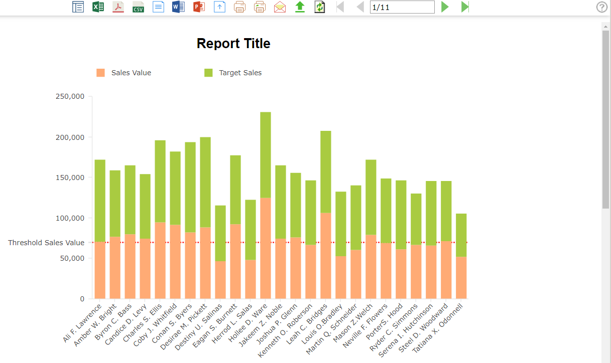
You can also see salespersons who have achieved Sales Value within a threshold band of values: